React Loading Skeleton
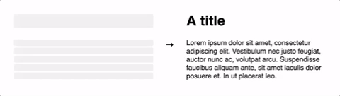
Make beautiful, animated loading skeletons that automatically adapt to your app.
Open on CodeSandbox
Make beautiful, animated loading skeletons that automatically adapt to your app.
| Prop | Description | Default |
|---|---|---|
count?: number |
The number of lines of skeletons to render. If
count is a decimal number like 3.5,
three full skeletons and one half-width skeleton will be
rendered.
|
1 |
wrapper?: React.FunctionComponent |
A custom wrapper component that goes around the individual skeleton elements. | |
circle?: boolean |
Makes the skeleton circular by setting border-radius to
50%.
|
false |
className?: string |
A custom class name for the individual skeleton elements which is used
alongside the default class, react-loading-skeleton.
|
|
containerClassName?: string |
A custom class name for the <span> that wraps the
individual skeleton elements.
|
|
containerTestId?: string |
A string that is added to the container element as a
data-testid attribute. Use it with
screen.getByTestId('...') from React Testing Library.
|
|
style?: React.CSSProperties |
This is an escape hatch for advanced use cases and is not the preferred
way to style the skeleton. Props (e.g. width,
borderRadius) take priority over this style object.
|
| Prop | Description | Default |
|---|---|---|
baseColor?: string |
The background color of the skeleton. | #ebebeb |
highlightColor?: string |
The highlight color in the skeleton animation. | #f5f5f5 |
width?: string | number |
The width of the skeleton. | 100% |
height?: string | number |
The height of each skeleton line. | The font size |
borderRadius?: string | number |
The border radius of the skeleton. | 0.25rem |
inline?: boolean |
By default, a <br /> is inserted after each skeleton so
that each skeleton gets its own line. When inline is true, no
line breaks are inserted.
|
false |
duration?: number |
The length of the animation in seconds. | 1.5 |
direction?: 'ltr' | 'rtl' |
The direction of the animation, either left-to-right or right-to-left. | 'ltr' |
enableAnimation?: boolean |
Whether the animation should play. The skeleton will be a solid color when
this is false. You could use this prop to stop the animation
if an error occurs.
|
true |
customHighlightBackground?: string |
Allows you to override the background-image property of the highlight element, enabling you to fully customize the gradient. See example below.
|
undefined |